2008-07-31

That funny judgement with the tree

I found this judgement through a Groklaw article some time ago. Recently I desired to reread it, but it took me quite a lot of tries to remember sufficiently precise search terms to locate it again. Clearly it has not received enough link love.

It's about a young couple who bought a house and cut down a mulberry tree which leanend over the backyard but actually belonged to their new neighbour. The neighbour sued. Fairly banal case, except that it is presented with hilarious wit.

I give you Thayer v. DeWolf, memorandum order by Magistrate Judge Goodbread, who I think would make a good hacker. Respectfully recommended for your reading pleasure.

2008-07-30

Rindler's relativity textbook

An open letter.

Dear Professor Rindler,

I write to thank you for writing Relativity: Special, General and Cosmological. I picked it up by chance at a university bookstore several years ago, and I've found it to be very enlightening and well readable.

I'm what one might call a physics amateur – not quite a physics student, certainly nothing resembling a researcher, but possibly a step up from the "educated layman" level. I like to extend my understanding of modern physics, for my own amusement and a sense of moral duty for a thinking being to at least try to understand the world he finds himself in. Here, by "understanding" I mean something deeper than memorizing some popularizer's free-floating qualitative assertions and analogies. Luckily, as a computer scientist with a B.S. in mathematics, I am no stranger to formulae – a mathematics-free understanding of any area of physics appears to be an oxymoron.

It is not easy to find good literature for a project such as mine. There are, of course, many books that purport to explain modern physics to laymen, but they all studiously avoid presenting any mathematical content of the theories they speak of. (The only exception I have encountered is Roger Penrose's The Emperor's New Mind, which however covers so much ground that its treatment of any particular subject is very brief). Even when they manage correct qualitative descriptions of a theory, they cannot, lacking formulae, convey a good sense of the predictive character of the theory. As for general relativity, popular works tend to stop at the rubber-sheet analogy, usually without even developing it enough to make it clear whether they try to depict spatial curvature or graph gravitational potential.

On the other hand, actual university textbooks tend to be too dry for the amateur. They often dive straight into formalism, with much time spent on methods of concrete calculation and little emphasis on intuition and perspective. The amateur (meaning I) tends to have little patience with problem-solving tricks; he wants to understand the structure of the theory more than he wants to apply it in practice (though, of course, one person's clever computational shortcut can become a basic feature of another's theory – as I understand it to have been the case for quantum electrodynamics). And above all, he needs hints about intuition and perspective. Intuition without mathematics is for cocktail-party philosophers, but mathematics without intuition is for robots. Apparently most textbook authors rely on the instructor for supplying students with the big picture, which is not unreasonable but does not help for self-study.

Your book, however, is a rare gem: A text that both teaches the formalism of the theory and explains what it means intuitively. In reading some of the sections, I have followed the mathematics carefully, checking derivations and doing exercises. This gives me a solid sense of knowing what goes on. In other sections I have skipped most details of the formulae but still got a general picture from the connecting text. This general picture is, in a sense, second-hand knowledge, but feels more secure than that, because the mathematical details are right there should I ever want to check them.

It is very wonderful that the book is capable of being read both ways.

I'm convinced that this book has made me smarter. It has enabled me, in many discussions with fellow amateurs, to correct (I hope!) misconceptions and confusions caused by fuzzy and imprecise popularizations of GR and black holes. I have been recommending it left and right. I'm very happy that it exists, and that I discovered it.

Sincerely yours,

Henning Makholm

* * *

Respectfully recommended for your reading pleasure: Relativity: Special, General and Cosmological by Wolfgang Rindler (Oxford University Press, 2001; 2nd ed. 2006). This book will teach you everything you want to know about special relativity (saw the Lorentz transform in high school and thought it was all there is to it? Think again), general relativity, black holes, as well as a fair overview of cosmology and tensor calculus. The preface promises: "Anyone who knows the calculus up to partial differentiation, ordinary vectors to the point of differentiating them, and the most useful method of approximation, the binomial theorem, should be able to read this book." As far as I can tell, that is what it delivers.

2008-07-29

Elections and geography

Some time ago I confessed that I read American court documents for fun. I cited the quality of some judges' writing as a reason for that, but a side benefit is some indirect insights into the half-continent of madness that is the United States of America. And sometimes, by contrast, into little old Denmark too.

Consider this recent case, Gonzalez v. Aurora. Several people from a western suburb of Chicago sued their city council, demanding that its voting districts be revised such that their particular racial group would be likely to get more seats on the council. Plaintiffs lost in the lower (district) court, and now they lost in the appeals court too. The court's opinion does not have the kind of dazzling rhetoric I wrote about earlier. But it made me think, about the differences and similarities between the political system it describes and the one I'm used to.

It probably ought to startle me that this matter is considered something that a court should decide at all, but it doesn't. In USA, it seems, everything is a potential matter for court intervention. Everyone who doesn't live in a cave probably heard about the 2000 presidential election.

What does trouble me a bit is that the plaintiffs' argument seems to assume that the voters in Aurora decide who to vote for using candidates' race as their first and final criterion. Such voter behavior is not unheard-of – in semi-failed post-colonial states suffused with mutual distrust between clans and ethnicities who find themselves sharing political structures by way of historical accident rather than sharing a functional society. But in a modern democracy with everybody integrated in a common economy? I know that when I go to vote, I try to vote for the candidate who shares my political views the most, rather than one who shares my complexion.

It might seem equally troubling that the appeals court willingly accepts this strange theory. But the court did find against the plaintiffs, and it makes for a stronger and more persuasive opinion if the court goes along with the losing party for the sake of the argument until the critical point where the loser's case breaks down. Implicitly, the court says "even if you were right about all this, you'd still lose because so-and-so".

But what really got me thinking was the unquestioned baseline assumption that most councilmen have to be elected in single-seat wards. Voters who happen to agree with the majority in their local ward get to be represented. Voters who are in a local minority become virtually, or nearly, disenfranchised. It doesn't matter if some political stance has a uniform 49% following everywhere; it gets zero electees because its popular support is insufficiently clumped.

I have heard people trying to justify such a system, but I've never been able to grasp their arguments. Why should geography matter? When I go to vote, I try to vote for the candidate who shares my political views the most, rather than one who by some quirk of the housing market happens to live close to me.

This would be quaint and amusing if is was a specific rarity of Aurora, Illinois. But it is sad that it is actually quite common. Most famously, perhaps, with the electoral college by which Americans chose their president. It is not a particularly American phenomenon, though. The UK House of Commons works the same way. And the way we elect the European Commission is perhaps the most indirect, convoluted and opaque of all, closely followed by the Council of Ministers which has the final political say in all matters EU.

Closer to home – in Denmark municipal councils are elected directly and proportionally, simple enough. But elections to our national parliament the Folketing, use a weird mix of geographic and proportional methods. Some members are elected in regional districts, with a number of additional at-large seats distributed afterwards such that the final party make-up of the parliament will get as proportional as possible. Then there are complex and elaborate rules for simultaneously distributing the at-large seats to ensure approximate geographical proportionality in the parliament as a body, as well as within each party.

Active politicians care about this system, because it decides which among each party's candidates win a seat, a matter of paramount importance among those running. Almost nobody else does, and look only to the final party breakdown (which, being guaranteedly proportional, can be understood without resorting to geography). When I've been a poll worker at general elections, some voters were obviously confused because the political leader of their choice was not on the ballot – he or she were running in a different district. Again, why should geography matter here? A smart voter tries to vote for the candidate who shares his political views the most, not one who happens to live in the same part of the country.

And, adding to the confusion, the district a candidate runs in does not have to be the district where he or she lives. In fact, for top politicians it is the exception more than the rule. Each party selects the running districts for its top candidates tactically, to maximize their chance of election given the above-mentioned rules that ostensibly exist to equalize the geographic origin of the MPs. Except that what it really equalizes is virtual pseudo-origins chosen solely based on the rules themselves.

Excuse me, but I fail to see that society at large benefits at all from this convoluted system.

(... now where was I? Something about a court and a city council in Illinois, I think. You mean I was supposed to have a point about that? Sorry. Still new to this blog thingie).

2008-07-27

Take my money if you must, but stop spamming

In 2003, after I completed my PhD dissertation in Copenhagen, I moved to Edinburgh to work as a post-doc for Joe Wells. Joe was rather eager to have me start as soon as possible such that I could receive a braindump from to the previous occupant of my position, who would be leaving soon. The plan ended up being that I'd complete and deliver the dissertation on Friday, and start work in Edinburgh the following Monday.

I arrived on Monday with a suitcase containing several changes of clothes. Meanwhile, my parents were cleaning out my flat in Copenhagen, packing my stuff into boxes and having it shipped to Scotland. (Thanks, Mom and Dad – you're the best!) Note to self: such tight schedules can not be recommended for future job changes.

The first thing I was told to do after I arrived was to go a bank and open an account into which my first salary could be deposited. Salary payments must be prepared some weeks in advance (paying out money always seems to involve red tape in proportion to the size of the organization), and I was arriving near the end of the month, so payroll needed an account number for me post haste. Otherwise they'd have to, I don't know, special-case my payment or something. That, apparently, would be a Bad Thing.

The Royal Bank of Scotland had a branch right on campus. I went there and they created an "instant access savings account" for me. A few weeks later I discovered that this was not quite the type of account I wanted; I'd rather have a "current account". I don't remember what the difference was. Presumably I had good reasons for switching.

For some reason, my existing account could not just have its type changed; I had to create a new account of the right type instead. Once I'd gotten the account number at payroll updated, I went to the bank and asked to have the savings account closed and its balance transferred to the current account. This happened.

Except that the savings account turned out to be not quite closed. At the end of the year I received an account statement for it. It had earned 6 pence of interest by containing half a month's salary for a few weeks, so its balance now read £0.06. There didn't seem to be any way to react to this that was worth the trouble, so I didn't.

[My letter to RBS]Time passed. Every so often, the monthly statement for my current account would be accompanied by another sheet reminding me that I had £0.06 in the savings account. In 2005 I moved back to Denmark. I had the current account closed (successfully) and its balance wired to my Danish bank.

But that poor savings account kept sending me statements for the same £0.06 several times a year. Each statement probably cost the bank at least ten times the outstanding balance to print and mail. But I'd become less than satisfied with the Royal Bank of Scotland's service (for reasons that I may blog about later if I find myself in a particularly petty mood one evening). Anyhow, I figured that they deserved it, somehow.

But perhaps three years is enough to forgive and move on. Today statement #12 arrived in the mail. I have just spent about a pound in stamps on returning it with a request to have it shut down.

Ain't I a nice guy?

2008-07-21

Tilting Iapetus

Now that I have a program to draw world maps with nonstandard orientations, I could not resist turning it loose on this albedo map of Saturn's moon Iapetus, pieced together from images taken by the Voyager 2 (1981) and Cassini (2005-2007) spacecraft. Iapetus is one of the strangest objects in the solar system. Its most famous feature is its "two-tone coloration": it has a light side and a dark side, and is much brighter when the light side faces the sun (and us). But there is more strangeness than that; go read the Wikipedia article.

In the novel version of 2001: A Space Odyssey, Author C. Clarke explained away all the strangeness with a deus ex machina solution: the entire moon is an alien artifact! He warned, however that "the truth, as always, will be far stranger."

Here is an ordinary map, with the central meridian chosen to go through the middle of the dark area:

We see a large dark splotch (named Cassini Regio) on a light moon. On the other hand, Clarke relates in the introduction to 2010: Odyssey Two that Carl Sagan sent him a Voyager image showing a white oval on a dark moon. How can that be? Let's get out our planet tilter:

The edge of this map runs along the moon's equator, in the middle of Cassini Regio. Now we see a light splotch (called Roncevaux Terra) on a dark background. Magic!

I've cheated a bit, though, by choosing the little-used Aitoff's projection for the above maps; it exaggerates the size of areas near the edge of the map. With the equal-area projection I used for Earth in my earlier post, the Roncevaux Terra map may begin to look more like a light world with a dark edge:

Finally, a map with the poles in the centers of the light/dark areas:

The boundary between light and dark does not really divide the moon into hemispheres; it goes more like the seam on a baseball.

2008-07-13

Cheap flights to Planet Barrel

Here is a poster I saw in the storefront of a travel agency in Frankfurt. I don't know which projection this world map tries to be, but if that isn't a barrel-shaped world it depicts, you can call me a barrel.

2008-07-12

No war on photography in Germany

Since 2001, the home front of the questionably-named "War on Terror" has devolved into what Bruce Schneier calls the war on the unexpected, in which anybody doing anything out of the ordinary risks being hassled by authorities, on the theory that activity that the person-in-authority does not understand might somehow be part of a terrorist plot.

A particular variant of this is the war on photography. It appears that in certain locales, photographing structures or buildings in public where the motives have no clear touristic interest, is considered particularly suspect. It makes a certain, tiny, bit of sense that a terrorist cell contemplating an attack might like to use photographs of the target and its surrounding in their planning. But it stretches my imagination to think that photographs would be such a sine qua non for a plan that banning photography would help much to prevent an attack by a determined group – at least when the photographs are of things that each would-be attacker could just walk up to and look at directly.

I am pleased to report that the war on photography has apparently not reached Germany.

I write this on the way home from a week's vacation in Frankfurt. My vacations are different from most because I have the rather weird hobby of collecting and understanding railway track layouts. There are quite a number of people who photograph, and otherwise obsess over, trains, but only few of us who lavish the same attention on the tracks the trains run on. In short, my idea of a good time is to go to a large station, hike out to the very ends of each of the platforms, taking lots of pictures of the surrounding trackage as I go. Then, if there are any public footbridges or streetbridges going over the track area, I go up on those and and repeat the exercise from there. Finally I take a train to another station, observing the neighboring tracks along the way, and either taking notes or photographing out the window. Repeat as long as daylight lasts.

This probably does not sound like fun to you, but it works for me. When I get home I sometimes get time to process all of the photos and notes into nice track diagrams for the areas in question; you can see some of the finished products at my website trackmap.net.

To get to the point, I've been doing this for a week – standing on the overgrown ends of platforms that are not being weeded because no trains stop that far out anyway, in plain sight of railway employees who didn't seem particularly busy (waiting for the train they are to work on), blatantly and obviously spying on their precious infrastructure. I even wear a terrorist beard. Yet, not once did anybody approach me to suggest that I shouldn't be doing what I did, or even to question what I was doing.

This is the same experience I had for a week in Vienna in 2007, a few days in Glasgow in 2006, and a week in Berlin in 2002. (Not quite true; in Berlin a couple of good-natured Bundesgrenzschutz officers did ask me what I was drawing – this was before good digital cameras became affordable to me, so I was using binoculars and a sketchpad instead. But they seemed to be more curious than suspicious, and ended up wishing me a nice stay after I explained in halting German what I was doing. In retrospect, perhaps they were just checking whether I would act hinky upon being asked).

The world isn't quite as bad a place as you would think reading about just the egregious blog-worthy extremes of the war-on-anything. Of course, that does not mean that the extremes don't deserve the publicity, ridicule and outrage they get. That is how we keep them from becoming the norm. But they are not yet normal, and that is a Good Thing.

Actually, they may or may not be the norm in America. I have read too many scary war-on-anything blog stories to dare go there and find out.

P.S. It just now occurs to me that one of the symbols I use in my hand-drawn sketches, a stylized tree meaning roughly "these tracks are visibly abandoned; shrubs and small trees growing between the rails", could easily be interpreted as a stylized mushroom cloud. Good thing my notes did not fall into the hands of an alarmist terrorist hunter. Except in 2007 I did foolishly forget a sketchpad in a train (and lost several days' worth of sketches). Wonder what happened to that ...

2008-07-04

Tilting the globe

We all know that the Earth is spherical (not exactly, byt close enough for my purposes here). But what world maps seem to tell us is that is more like a cylinder. Wider at the equator, though – barrel-shaped perhaps?

Why, just look at the map:

We know that the left and right edges are really the same place; there is only one Pacific Ocean. It's not too unusual either to have seen maps where the edge is some meridian other than 180° E/W, such as this:

So we're familiar with the fact that if we keep moving east or west long enough, eventually we'll end back where we started. This striking enough that circumnavigating the globe is considered something in and of itself (Phileas Fogg never ventured south of the Equator, but is nevertheless considered to have gone around the world). But it does not feel strange, as such.

The poles, however, are weird. In the projection I have chosen here, each pole has been deformed from a point into a curve that forms the entire top or bottom edge of the map. We know, intellectually, that this is just a coordinate singularity, an artifact of the map projection. To someone actually standing on the pole, the ground will appear just as flat and featureless as it does anywhere else, modulo mountain ranges and other minor details.

But knowing is not the same as really believing. We feel vaguely – or perhaps I should stop speaking for everyone else at this point – I feel vaguely that this coordinate weirdness somehow must correspond to a real weirdness, that if I were to go there I would somehow distort along with the map, like the proverbial gedankenastronaut who falls into a black hole and finds himself stretched by infinite tides in the east-west direction.

A more everyday symptom of barrel-shaped thinking is the surprise we've all felt at some point noticing just how close to the pole a great-circle route between two distant cities goes. If you fly from London to Tokyo, the standard maps invite the assumption that you should head to the east and slightly south. But actually you should start out in a northeastern direction and pass quite close by Helsinki.

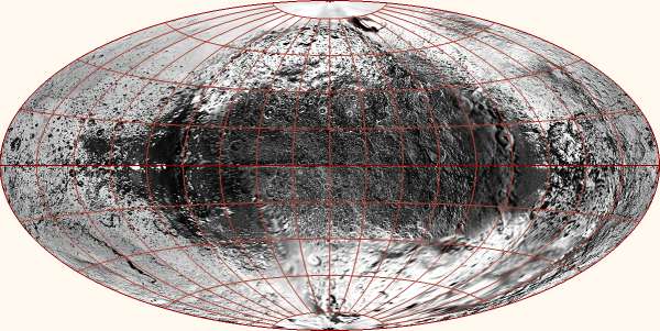
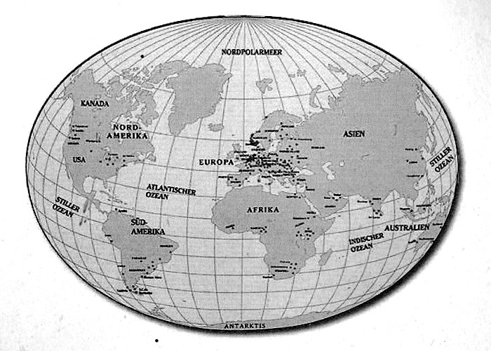
I set out to disabuse myself of the barrel-shaped fallacy. 
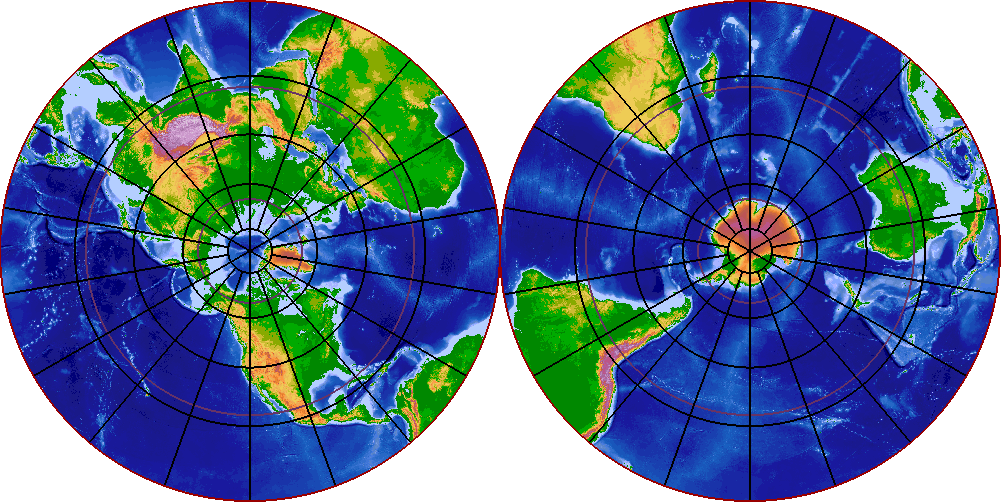
The first step is to look at a map which does not distort the poles – a pole-centered azimuthal projection:

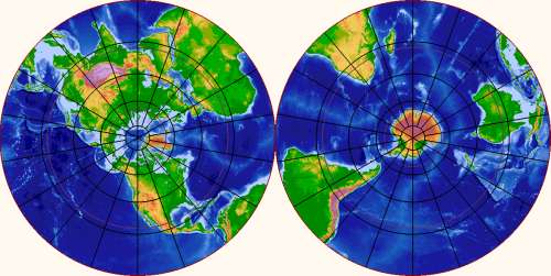
This helps a bit, but not by much. The coordinate lines of the polar map still implicitly convey the message that the pole is a very special place. There's still a feeling that it has some momentous topological significance whether a path from point A to point B passes left or right of the the pole. Perhaps I just lack imagination, but I still find myself thinking in barrels when I look at a pole-centered map. Map globes are not much better; they tend have bearings and other special decorations at the poles which fuel the barrel fallacy directly.

Stronger measures are needed here. The trouble seem to be the map grid – how about we draw a completely different grid over the polar regions? We could pretend that the Earth's axis passed through, say, Hawaii, and draw the world map that would result.

That sounds promising. More significantly, it sounds fun. So I wrote myself a program to draw world maps with alternative positions of the poles. I find the results convincing and fascinating. 
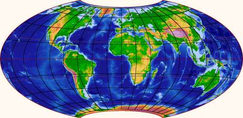
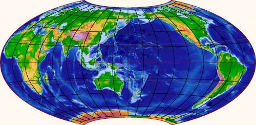
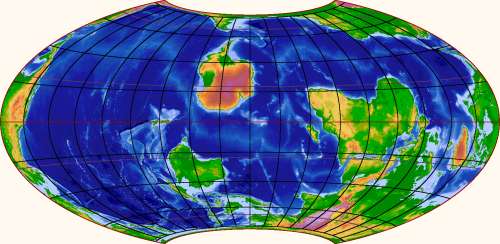
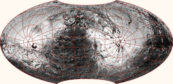
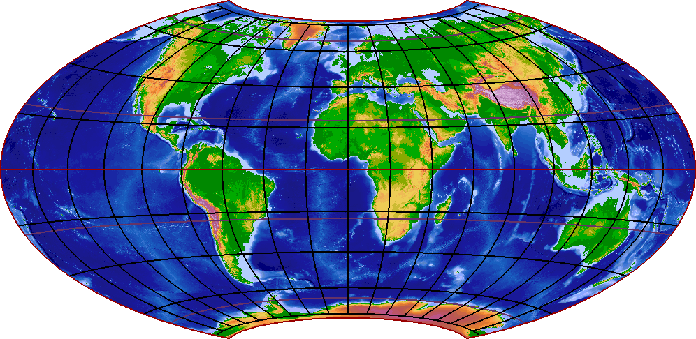
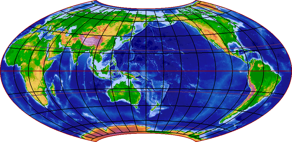
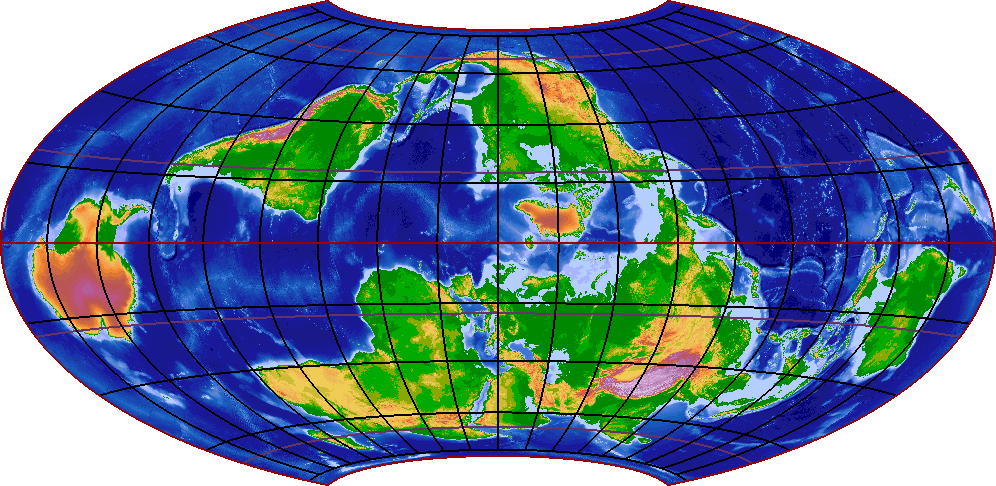
Here is the pole-at-Hawaii scenario, with two different central meridians:

The antipode to Hawaii proves to be in southern Africa, so that is where the other pole goes. The shape of Africa gets strangely distorted by the map projection, which should teach us to doubt what normal world maps tell us about the polar areas. The other continents look more recognizable, except – wonder of wonders! – the Arctic Sea is now clearly just another place.

The fascinating part comes from wondering: If the world was actually tilted to turn around the Hawaii axis (but otherwise with its current orbit and axial tilt), which climate would such a world have? Latitudes give a crude hint at the weather at different places, but that is far from the whole story. Sea currents transport large amounts of heat around the globe, and the currents would be vastly different on the tilted globe, driven as they are by winds and Coriolis forces. The winds themselves would be different; winds try to align more or less with latitudes but are deflected by mountain ranges and warped by differences in sea temperatures (which are themselves governed by currents, which are driven by winds, making the whole thing recursive). I cannot even start to answer the climate question, but I'm sure a good answer would be very interesting.

After climate comes culture. How would world history have unfolded on the tilted globe? For example, this world does not seem to need a Columbus. What, if anything, would that change? Would the Industrial Revolution still happen in a tropical, upside-down Britain? I suspect there's some pretty cool alternative-history fiction waiting to be written here.

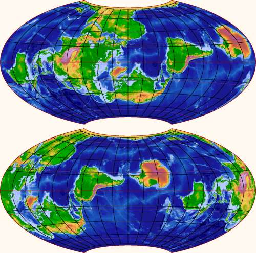
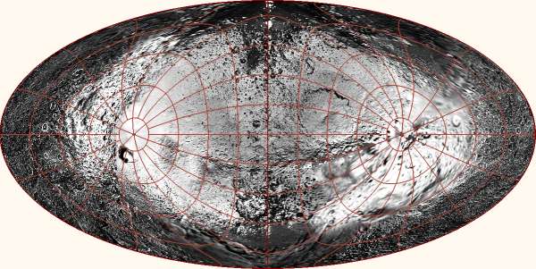
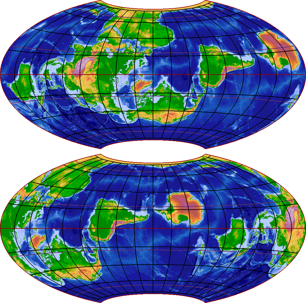
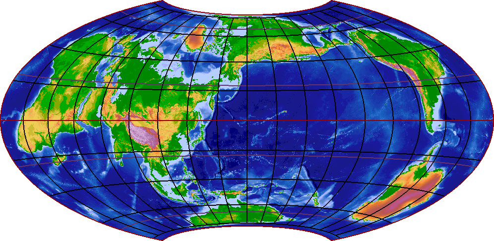
There's no reason to stop at Hawaii, of course. After creating my program, I have (mis)spent several nights looking around for interesting places to put the poles. Here is one that shows all of the continents are connected:

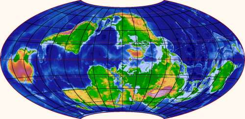
This map has the nice feature that no continental land or shelf is bisected by the edge. That is not not trivial to achieve because the edge of a world map of a somewhat orthodox shape must represent half a great circle, and there isn't much wiggle room to place it without hitting land. I think there are only three essentially different solutions; here is a second one, showing continents in a circle around the Pacific Ocean:

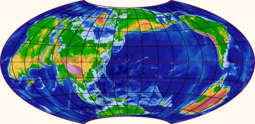
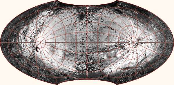
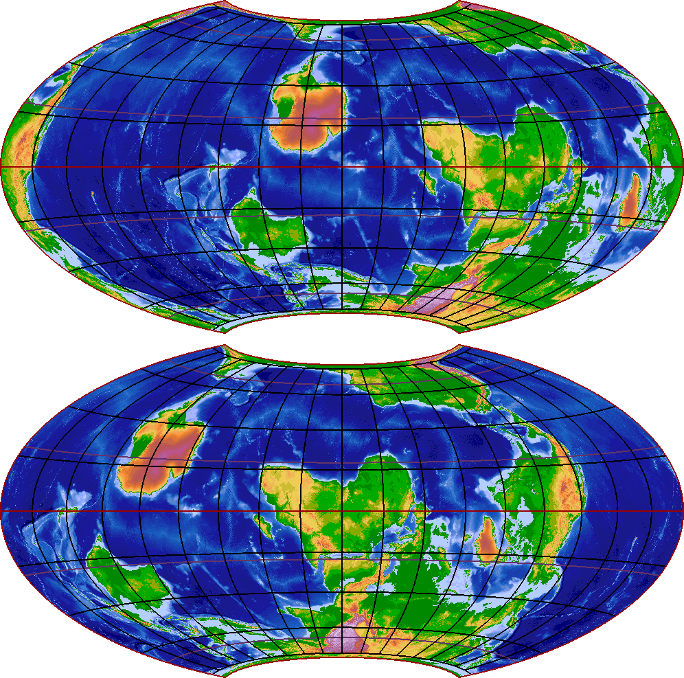
On the other hand, getting both poles to be covered with land is even harder. The best possibility seems to be this, which just barely does the trick:

Note here in particular that the only "wet" passage through the edge of the map is the Bering Strait (save for the wiggliness of the Panama isthmus, which the straight edge cannot quite follow). This map tries to tell you that all of the oceans are really just a single sea surrounded by land. The previous two ones try to tell you that the continents are really just a group of islands on a water planet. Both, however, show the same planet. We shouldn't believe any single map too much.

P.S. I got the shapes of continents, with elevations and sea depths as a bonus, from the ETOPO2v2 dataset, which is a marvelous resource. My only regret is that I can't drain away the icecaps of Antarctica and Greenland, but it's not obvious how to define the result of that. And it is free! You too can create cool alternative world maps if you know a programming language and some spherical geometry.